
.svg) Product
Product

.png)




Table of content
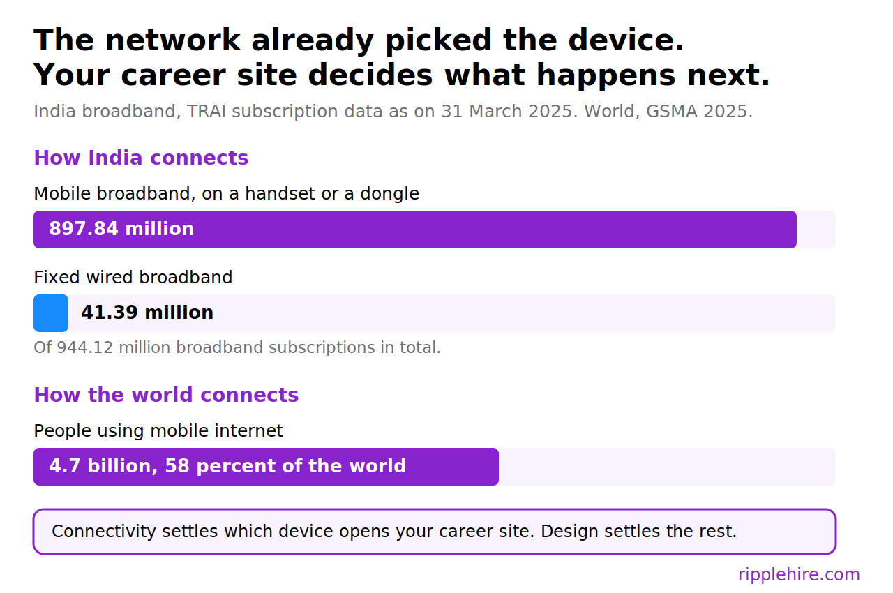
Hiring in India reaches people through a phone long before it reaches them through a desktop browser. The Telecom Regulatory Authority of India, in its telecom subscription data for 31 March 2025 released on 7 May 2025, counted 944.12 million broadband subscriptions in the country.
Mobile broadband accounted for 897.84 million of them. Fixed wired broadband accounted for 41.39 million. For almost everyone in the market you hire from, broadband is a phone, which makes mobile-first job applications India a design constraint on the career site rather than a channel decision.
A career site built around a desk is betting against the only connection most candidates have. The same bet is on the table well outside India, since the GSMA's State of Mobile Internet Connectivity 2025, published on 9 September 2025, puts 4.7 billion people on mobile internet, equal to 58 percent of the world's population. Multinational employers who rebuild the application flow for India usually find they have rebuilt it for every market where the phone arrived before the laptop.
Enterprise talent teams need an application flow a candidate can complete in one sitting, on a mid-range Android device, over a network that shifts between wifi and a patchy mobile signal.
Why the phone is the safer default for an enterprise career site
Career sites at large enterprises were specified in an era when the reference device sat on a desk, usually the recruiter's own. Distribution has moved since then, even where the underlying platform has not. Mobile recruiting in India in 2026 is less about adding a channel and more about removing the steps a phone cannot complete.
Two arguments make mobile the safer planning default, and neither of them needs a behavioural statistic to hold.
Job openings now travel through channels that live on a phone. A referral link arrives on WhatsApp, a recruiter's post surfaces in the LinkedIn app, a campus coordinator forwards a form over a messaging group, and a sponsored listing opens inside an in-app browser rather than a full desktop browser.
Each of those journeys hands your career site a viewport roughly 390 pixels wide, a webview with quirks, and a candidate who was doing something else thirty seconds ago. Channel names change from market to market, and the constraint they hand you does not.
The cost of guessing wrong is also asymmetric.
A candidate on a laptop completes a well-built mobile flow without noticing anything unusual, since the same form scales up cleanly. Someone holding only a phone cannot complete a flow that expects a file system, a full keyboard, and an uninterrupted twenty minutes. One design choice serves both groups and the other serves one, which settles the question without needing a percentage.
Funnel data tends to reach that conclusion faster than principle does. Enterprises running high-volume hiring without losing control watch completion by device for exactly this reason, and the same reporting usually shows how positive candidate experience helps businesses grow further down the funnel.
Where desktop-era assumptions still live on enterprise career sites
The gap between a responsive template and a genuinely mobile apply flow is where candidates disappear. Responsiveness fixes layout, and layout was never the hard part.
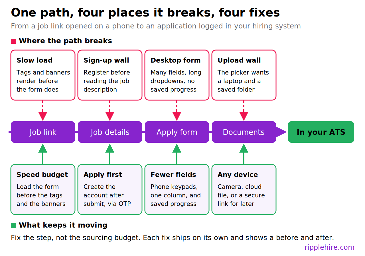
4 friction points do most of the damage:
Pages that need more than three seconds to become usable
Speed is the first filter, and it runs before any content persuades anyone of anything. The HTTP Archive Web Almanac 2025 performance chapter, published on 15 January 2026, found that 48 percent of mobile websites passed Core Web Vitals against 56 percent of desktop websites, and that 74 percent of desktop pages recorded a good Largest Contentful Paint against 62 percent on mobile. Read that as broad web performance rather than career site data. It still carries a fair warning for anyone signing off a career site: a page that feels quick on a desk often is not quick on a handset.
Google's Web Vitals guidance supplies the number worth testing against. It recommends assessing performance at the 75th percentile of page loads, split across mobile and desktop.
- Under 2.5 seconds at the 75th percentile. You are inside Google's target. Track it and move on.
- Between 2.5 and 3 seconds. You have drifted off target. Investigate before the next hiring drive adds traffic.
- Above 3 seconds. Escalate. Treat the apply page as broken for mobile and fix it ahead of new sourcing spend.
Much of the recoverable time sits in third-party tags, hero images sized for a desktop banner, and analytics scripts that load before the form renders. Strip the apply page back to what the application needs, then measure field data from real devices.
A lab score from a developer's machine says nothing about a candidate on a train.
Document uploads that assume a desktop file system
Upload steps carry a hidden instruction: go and find a file on a computer. A phone-only candidate has the CV inside an email attachment, in a cloud drive, or as a photograph of a printed copy, and an upload widget built around a desktop file picker turns that into a dead end.
In-app browsers make it worse, since some webviews break the picker outright and give the candidate no error to act on.
Fix the step by widening what counts as an acceptable document and by moving collection to the moment it is actually needed:
- Accept images alongside PDF and DOCX, and let the camera capture a document in place
- Allow import from cloud storage and from a pasted profile link
- Compress and convert on your side rather than rejecting a large file
- Ask for identity, education, and experience documents at the stage that uses them, not at first contact
- Send a secure upload link over email or WhatsApp so the candidate can finish on any device later
Account creation before a candidate can read the job or apply
Registration walls exist for good operational reasons, including duplicate control and returning applicants. Placed at the front of the flow, they ask for effort before the candidate has any reason to spend it.
Follow one candidate through a typical enterprise career site. They tap a referral link on WhatsApp during a lunch break and land on a page that wants a registration before it will show the job description. Signing up needs an email confirmation, which means leaving the browser and coming back to a session that may have expired. The password rules arrive next, and nobody remembers the result a week later.
Move the account to the end.
Let candidates read everything, apply with the fields you genuinely need, verify with a one-time password on the number they already gave you, and build the profile from that submission.
Platforms offering loginless application forms work this way, with deduplication solving the identity problem afterwards instead of asking the candidate to solve it in advance. Work on candidate experience with agentic AI follows the same principle, since the system absorbs steps the candidate used to perform by hand.
Registration serves your operations. Do not charge the candidate for it before they have seen the job.
Forms built for a keyboard and a mouse
A form that works on a phone is a different artefact from a desktop form rendered narrow. Field count, input types, and session behaviour all change what the candidate experiences. Each swap below costs little engineering time and removes a specific reason people quit.
|
Desktop-era habit |
What the phone version does |
|---|---|
|
Every field anyone has ever asked for |
Only the fields a screener uses this week |
|
One generic text box for numbers and dates |
Correct input types, so the keypad and the date picker appear |
|
Two columns and dense radio grids |
A single column with full-width controls |
|
A dropdown listing every institution in the country |
A search field that filters as the candidate types |
|
A session that expires and takes the draft with it |
Saved progress and a resume link the candidate can reopen |
|
A CV upload followed by retyping the same details |
A parsed CV that prefills the form |
Someone on your team should complete the whole thing on their own phone, on mobile data, without touching a laptop. That walkthrough surfaces more than most audits, and it is the cheapest research a talent function can run.
How to audit your career site mobile experience
An audit turns opinion about the design into a step-by-step measurement of candidate drop-off on the apply page. The point is not a score out of ten, it is a ranked list of the steps losing the most people, which is the same discipline behind optimizing the recruiting funnel at every other stage. Run the numbers first, then walk the flow yourself, because the two methods catch different problems.
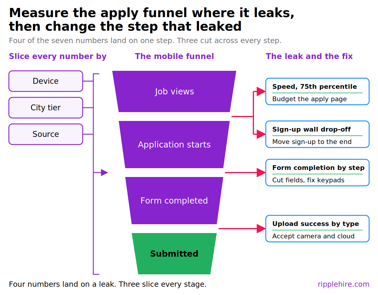
Pull seven numbers before anyone touches the design
Ask your web and ATS teams for the same period, ideally a full quarter, and split every figure by device:
- Device mix across job views, application starts, and completed applications.
- Page speed at the 75th percentile for the job listing and the apply page, mobile and desktop separately.
- Step-level completion through the flow, from job view to start, to each form page, to submission.
- Upload success rate, including failures by file type and file size.
- Account creation drop-off, measured at the registration wall itself.
- Completion by location, grouped by city tier or by pin code where you have it.
- Completion by source, so referral, campus, job board, and career site traffic stay separable.
Four of those land on a single step, which is where the loss happens: page speed and the registration wall on the way into the form, step-level completion inside it, and upload success on the way out. Three of them cut across every step instead, because device, location, and source are ways to slice each number rather than places to take it. The gap between mobile and desktop completion at any single step is the finding. Teams that already track candidate experience with quantitative and qualitative data can slot these seven into an existing review rather than building a new report.
Walk the flow yourself on a real device
Numbers show where people leave and almost never show why. Book an hour, take a mid-range Android phone off wifi, and apply to one of your own live openings from a link opened inside a messaging app.
- Time how long the apply page takes to become usable, not merely to start painting
- Try the upload with a photo of a CV and with a file from a cloud drive
- Count every tap and every typed character from job view to submission
- Note the first moment you want to give up, and the reason
Set the walkthrough beside the funnel view your recruiting team already keeps, using a structured approach to tracking the talent acquisition funnel so the two are comparable. Where they disagree, the disagreement is usually the finding, which is the argument made in the session on fixing the candidate drop-off funnel.
Test whether your apply flow filters tier 2 and tier 3 talent
A poor mobile experience may filter candidates from tier 2 and tier 3 cities more heavily than it filters metro candidates, on the reasoning that a phone is more likely to be the only device available and the network less likely to be stable.
Treat that as a hypothesis about your own funnel, not as an established fact, and design a test that can disprove it. The hypothesis also travels, since any market where candidates outside the largest cities are more likely to be phone-only deserves the same check, whether your segments are called tiers, secondary cities, or regions.
The test uses data you already hold.
- Segment application completion by location and compare tier 2 and tier 3 candidates against metro candidates at each step, particularly upload and account creation.
- Compare device mix across the same segments, then check whether the sourcing channels that reach smaller cities show systematically lower completion than channels that reach metros.
- Add a small qualitative round, with five to ten candidates from those markets completing the flow on their own devices while someone watches.
Two outcomes matter and both are useful. If completion holds steady across segments, you have retired a hypothesis and can spend elsewhere. Where the gap shows up at a specific step, you have found a defect in the flow rather than a shortage of talent, which is a far cheaper problem to solve than the one you would otherwise fund.
Enterprises investing in employer brand across tier 2 and tier 3 campuses should run this check before the next campus season, since the sourcing spend assumes an apply flow that converts what it attracts.
Choose RippleHire to make the mobile apply path the easy path
Every fix in this article points at the same conclusion. The constraint behind mobile-first job applications India is not the template, it is the system behind the form: where the account gets created, how documents arrive, how duplicates resolve, and whether anyone can see step-level drop-off by device.
RippleHire is the place where recruiters and agents work together. It is an AI ATS for global enterprises, running at one hire every four minutes across more than 50 countries and more than a million users. Customers report candidate experience scores of 4.5 out of 5 and higher, and a score like that is won or lost inside the steps this article describes.
What that gives a talent function fixing its career site experience:
- Mobile-friendly, loginless application forms, so a candidate applies without building an account first
- AI-based deduplication, which keeps the candidate database clean once the registration wall comes down
- No-code configuration of forms, workflows, and compliance fields, so shortening a form does not wait for a release cycle
- Extended communication over text, Microsoft Teams, and WhatsApp, for document requests and status updates that reach a phone
- Reporting and analytics on funnel bottlenecks, which is where a device-level drop-off shows up before anyone reports it
Book a demo to see a loginless mobile application flow end to end, and the funnel reporting that shows exactly where candidates leave your application page.
Frequently asked questions
What changes for recruiters day to day when the apply flow moves to mobile first?
Recruiters see more complete applications and fewer half-finished profiles waiting for documents to arrive. Screening shifts earlier, because the information comes in one submission rather than across several follow-ups and reminder calls. The trade is a higher volume of applications reaching first review, which makes screening criteria and deduplication matter more than they did when the form itself filtered people out.
How should we sequence fixes when a full career site redesign is a year away?
Work in the order the funnel gives you. Page speed usually goes first, since it needs no design decisions and every later step inherits the benefit. The registration wall follows, because it asks for effort before a candidate has seen anything worth the effort. Field reduction comes next, then upload flexibility. Each of those ships independently of a redesign, and each gives you a clean before and after to review.
Which teams need to be in the room to fix a mobile apply flow?
Talent acquisition owns the field list and the stage at which documents get requested. Web or digital owns page speed and the front end. The ATS or career site vendor owns whatever sits inside their hosted pages, which is often the apply form itself. Bring compliance in early for consent language and data retention. Name one accountable owner in talent acquisition, or the work stalls between calendars.
How do we keep late document collection compliant when candidates upload from a phone?
Agree the consent and retention rules before you move collection later in the process. Tell candidates what each document is for, how long you keep it, and who inside the company can open it. Keep uploads inside the hiring system rather than in a recruiter's inbox or a chat thread, and log every access. Local rules differ by country, so settle the standard once with compliance and apply it across markets.
What should we ask a career site or ATS vendor about mobile during evaluation?
Ask for field data from real candidates rather than lab scores, on mobile, for a live customer's apply page. Check whether an application can be submitted without account creation, which file types and capture methods the upload accepts, and whether progress survives a dropped session. Ask how they report step-level drop-off by device. Request a walkthrough on a phone during the demo instead of a shared desktop screen.